Keywords: Boxplot, box plot, stem and leaf plots, Excel 2007, how to make
Version: Excel 2007
Dowload:
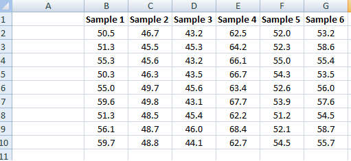
Since the previous entriesI have recieved quite a few questions about Box-plots in Excel 2007, so I decided I should describe one way to create decent looking box plots in Excel 2007. In my example I start with a set of data containing six samples with ten replicates each, and from this I want to create a box plot showing the extremes, median and the quartiles.
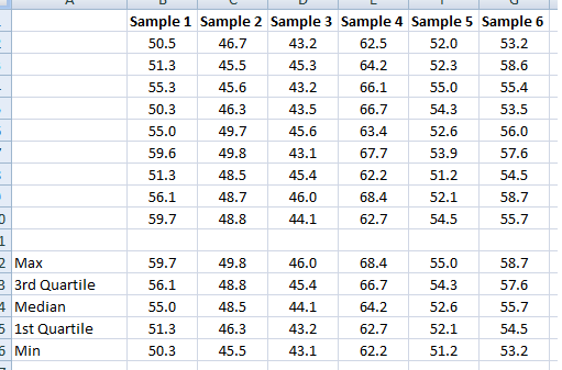
I create five new rows (12-16), max, 3rd quartile, median, 1st quartile and min and then calculate the statistics accordingly in cells B12:B16:
              =MAX(B2:B10)

              =PERCENTILE(B2:B10,0.75)

              =MEDIAN(B2:B10)

              =PERCENTILE(B2:B10,0.25)

              =MIN(B2:B10)
Then copy to cells C12:G16.
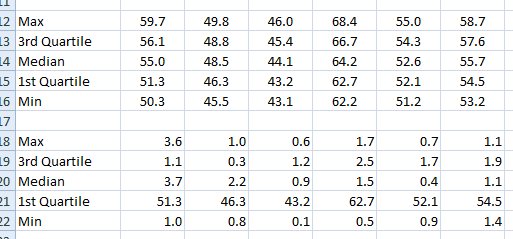
Since we will “trick” Excel to draw a box-plot and use a stacked column chart we have to modify our data slightly. The first segment of the stacked column will be invisible and end where the lower boundary of the 2nd quartile begins ( =PERCENTILE(B2:B10,0.25) ). The next segment will consist of the 2nd quartile (median-1st quartile, or B14-B15). The third segment is the 3rd quartile (3rd quartile – median, or B13-B14). The length of the whiskers representing the max and min values are calculated as 1st quartile – min or B15-B16 and max – 3rd quartile, or B12-B13.
These values are calculated in a new range, see image below.
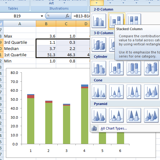
Now I’m ready to insert the chart. I select the range B19:G21 (see image below) and select a 2D stacked column from the Insert–>Table menu.
Next we add the whiskers. Select the second segment, click on Chart Tools –> Layou –> Select Error bars –> More error bars options and pick the Display Direction: Minus, indicate the Error Amount: Custom and click the Specify Value button. Leave the Positive Error Value as is and select the range containing the Min values for the Negative Error bar.
Repeat for the max value whiskers. The chart now should look like the one in the image below.
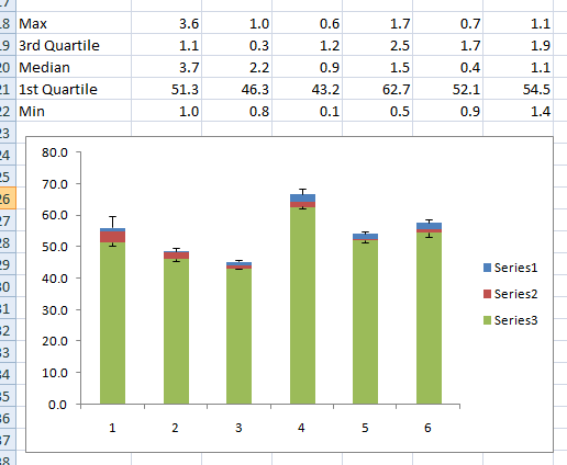
To make the chart a bit neater, right-click the lower segment series (green series in the image) and select properties and make invisible. Format the rest of the chart to your liking. Done!
Good luck, and enjoy your new Box plots.
Popularity: 100% [?]
Thanks a lot for the tutorial.
I was sure, Excel could do that out of the box but okay. Using your guide saved me quite some time.
Great post!! unfortunately this method breaks when some of the quartiles are negative. there you would need to split your data Table into two tables ( one for the positive values only and another one for the negative values only ). only then can you start calculating the differences and plotting the bars.
There is a post on this blog with a method to handle negative values as well, look it up if you like.
You just made my day better. Thank YOU!!
Excellent tutorial!
thanks u so much,, u just save me
GOOD!
Hi there,
I have the same question as Celeste — how to tweak formula for negative numbers. I have a data set that is a calculation of the percentage change between FY 10 and FY 08. the results range from negative to positive. The data set is widely varied and I’d like to remove some of the outliers.
thanks for your advice!
You can find a guide for that here: https://bloggpro.com/creating-a-boxplot-in-excel-2007-with-negative-values-in-dataset/
Hey,
I was very happy to find your description, however, I was wondering how the second step, where you tweak the max, min… et c, would work if you had negative numbers? The reason that I ask is because I have a project where the numbers range from positive values to negative values.
Thanks for your help!!
Hi, I need to do a box and whisker plot in excel 2007, but first I have a whole bunch of data that I need to find the median for. However, I am having trouble finding the median because I have used the filtering option in excel and the median includes all the hidden rows – does anyone know how I can get around this?? I have a relatively limited knowledge of excel, so if someone has a simple solution, that would be great!!
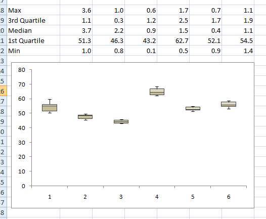
Another way of making a box plot, a little simpler and faster but with not quite as elegant a result, is to use the Volume-High-Low-Open-Close stock chart.
1. Array your data as shown above, with the quartiles, median, etc.
2. Arrange it so that the data appears in the following order in successive rows:
- Titles
- Median
- 3rd Quartile
- Maximum
- Minimum
- 1st Quartile
This is necessitated by the data order that the chart expects.
3. Create the chart. The primary axis is the “volume” and represents the median. The secondary axis is the “stock price (high-low-etc)” and represents the boxes.
4. Select the primary axis and change the maximum to be equal to the maximum on the secondary axis. This moves the top of the median bar to its correct place.
5. Select the plotted boxes and change the fill to be semi-transparent. You want the median bar to show through. It will divide the boxes at the median value.
Though the median bar show up below the plotted boxes, with careful colour selections you can minimize the impact of this.
If you really need to draw a lot of box plots, you should probably be investing in Minitab (which is what I usually use).
The best method for Excel 2008 Mac is there: http://www.coventry.ac.uk/ec/~nhunt/boxplot.htm
It gives you the right y-range, but the median is marked as a marker instead of the conventional line across the box.
This was very useful. It did not quite work in Excel 2008 for Macintosh because the ordering in the stack was different and the error bars are set up very differently. However, with this as a starting point I was able to get the plots that I needed. Thanks.
Hi,
Please help me…
I am unable to get the error bar (both minus and plus simlatneously) when I apply for minus, i get the result, and then when you try to apply fror the plus, the minus error bar disappears.. I am using 2007. Please let me know where i am going wrong?
i need a boxplot for my values..please help me..i have already watched how was the trick done on youtube but my values are reall sumthing..pls help.. here are the values..
A
1.63
1.63
1.62
1.63
1.62
1.63
1.63
1.63
1.63
1.63
1.63
1.63
1.62
1.63
1.63
———
B
1.61
1.6
1.6
1.6
1.61
1.62
1.61
1.61
1.54
1.54
1.57
1.54
1.62
1.61
1.61
I don’t understand any of this.